logo and branding | Buckwingster
background
Buckwingster aims to give birds safe sanctuary from ever changing climate using style and sustainability. This eco-chic brand is inspired by Buckminster Fuller, an environmentalist visionary and inventor who focused on sustainability and human effects on the world. Birdhouses designed with the geodesic shaped roof designed by Fuller will provide birds with strong and stylish homes that are constructed with recyclable materials that act as a reminder to our shared environment. The target audience would be environmentally conscious homeowners focusing on blending style and function in their outdoor space.
Creating a brand identity inspired by a person from history I chose to focus on the geodesic dome, one of Buckminster Fuller’s most successful designs. I sketched and expanded on several logo ideas. Once a logo was chosen I picked colors that I felt exuded a luxurious feel. I envisioned owners of beautiful expansive yards and those with smaller well-kept yards for my target audience. Creating stationery and business cards was the final phase of creating the brand identity.
design problem
design process
design solution
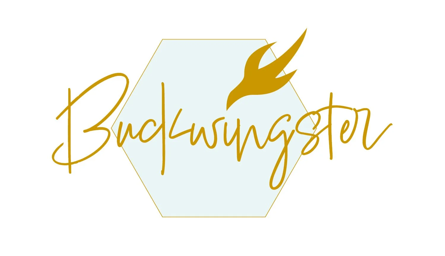
Using Adobe Illustrator, Indesign and Photoshop I was able to create a brand identity focusing on the hexagon as the primary symbol of the brand. A gold outline (PMS117 UC) was used as the outline and a light blue (PMS 628 UC) was the fill with a 29% opacity. The typeface I chose is Lindsay. A golden bird is the tittle of the logo. Buckwingster is a play on Buckminster’s name and the wing of a bird. The logo has an expensive and upscale feel to it.


